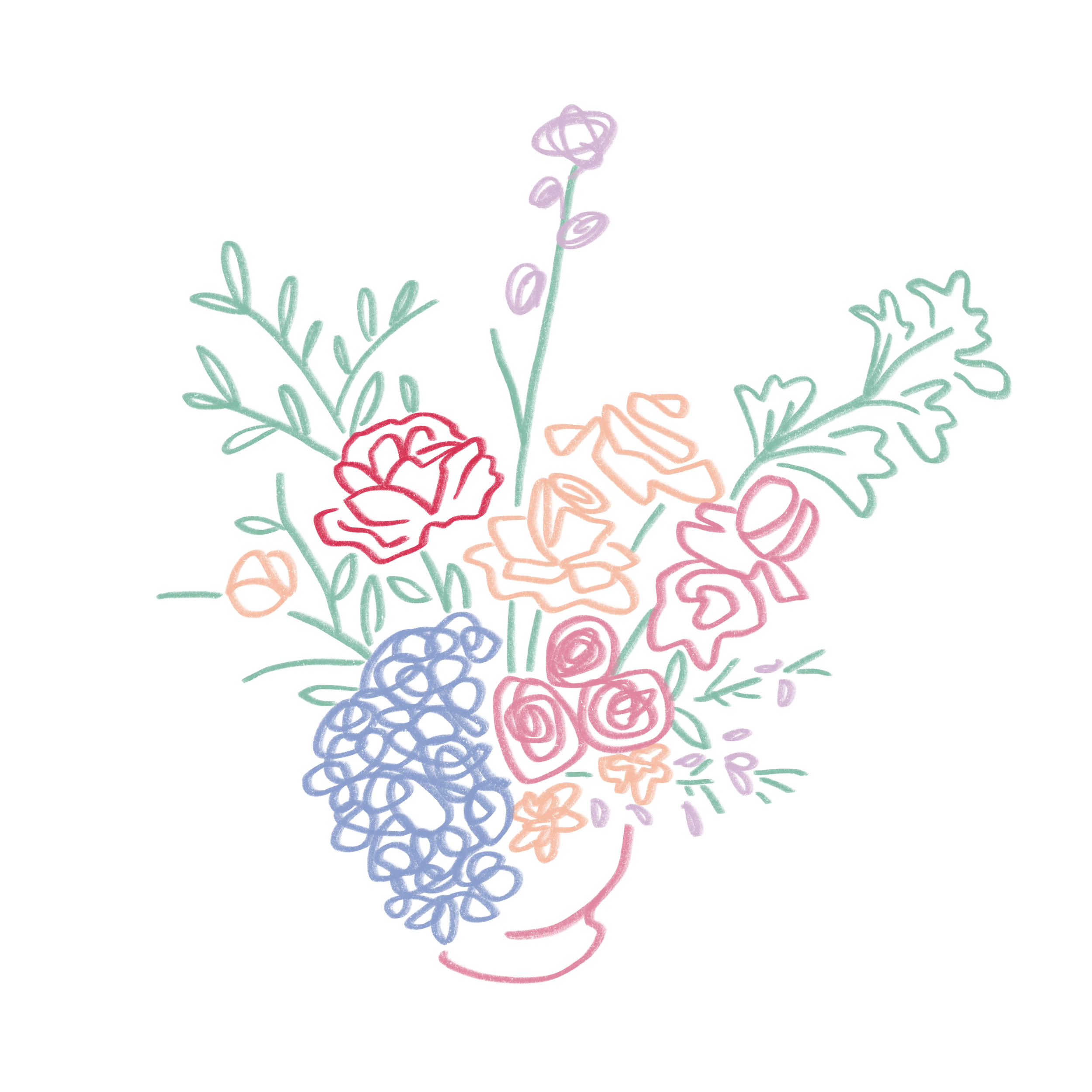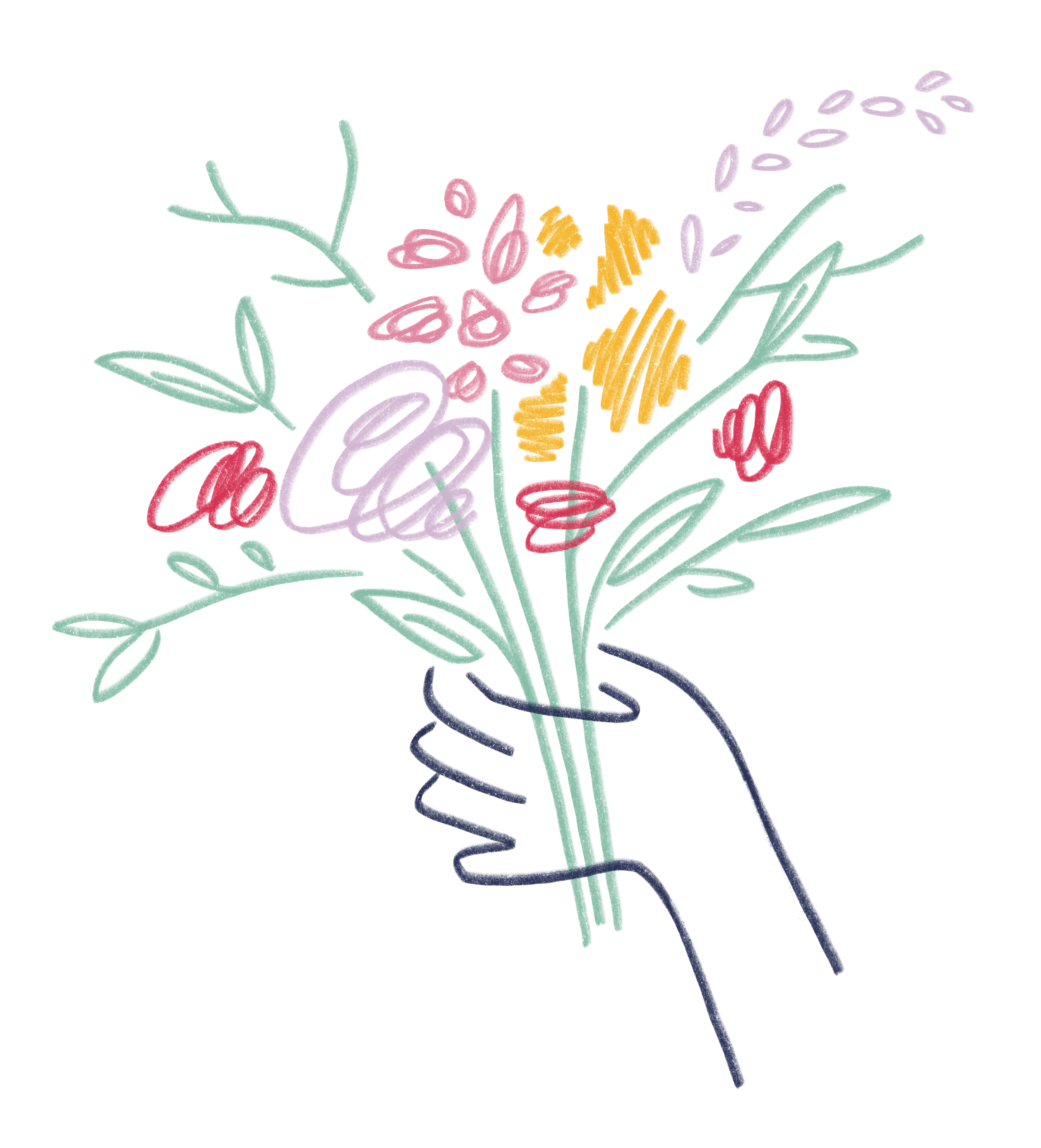
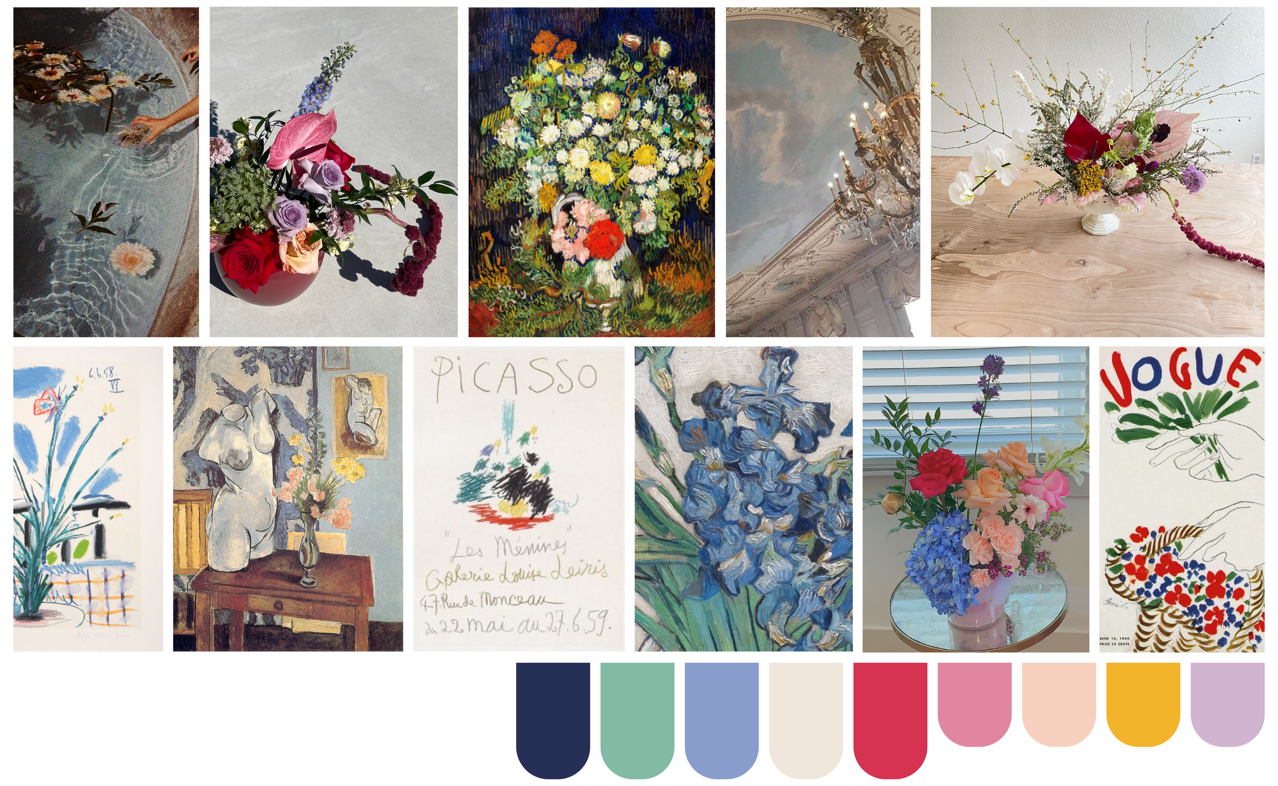
Moodboard & Color Palette
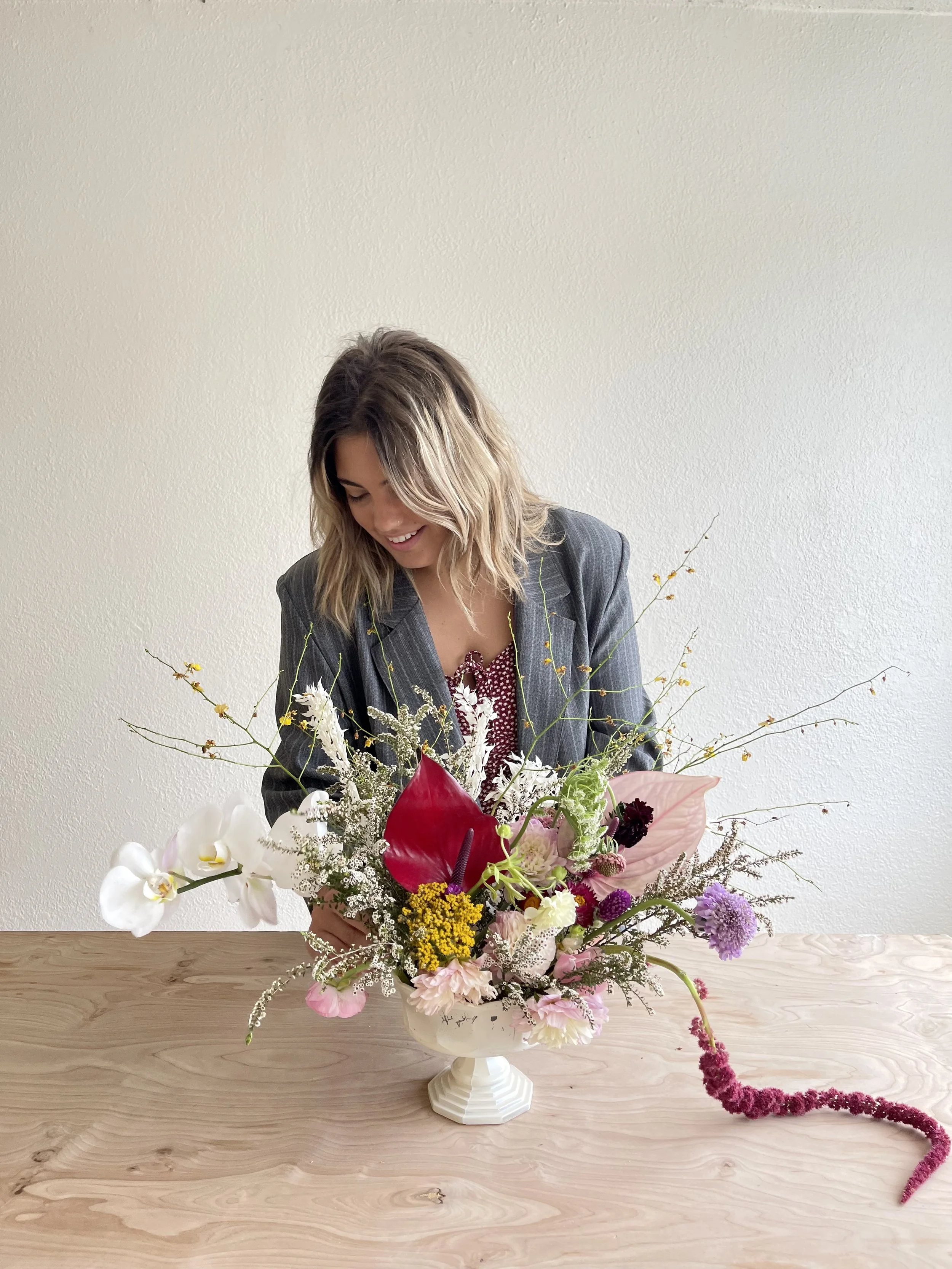
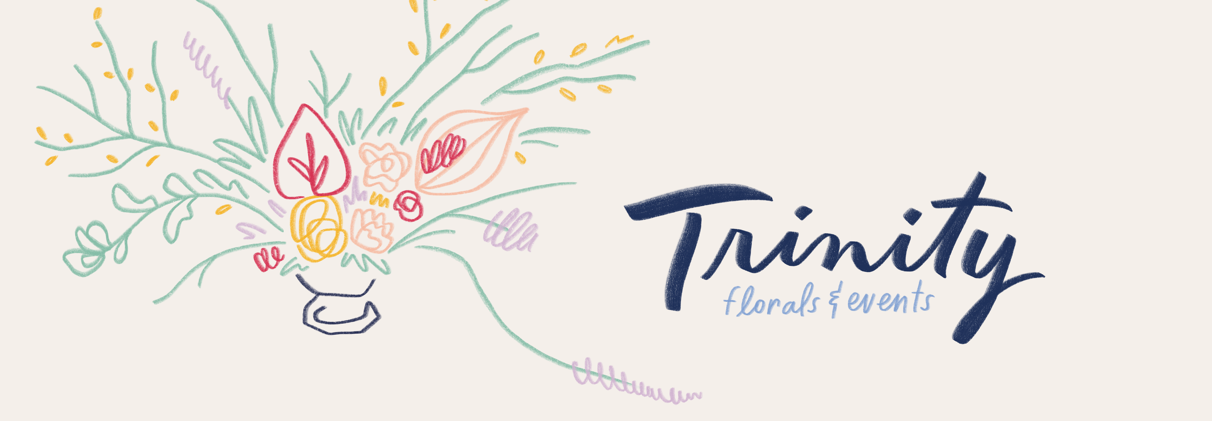
Trinity (the brand and the person) was inspired by the great artists of the past, from Van Gogh to Picasso. Her floral arrangements are works of art themselves. She creates truly original designs, nothing like the wedding bouquets and floral arrangements that you see all over Pinterest. I wanted her branding to reflect her as an artist and her vision for her company.
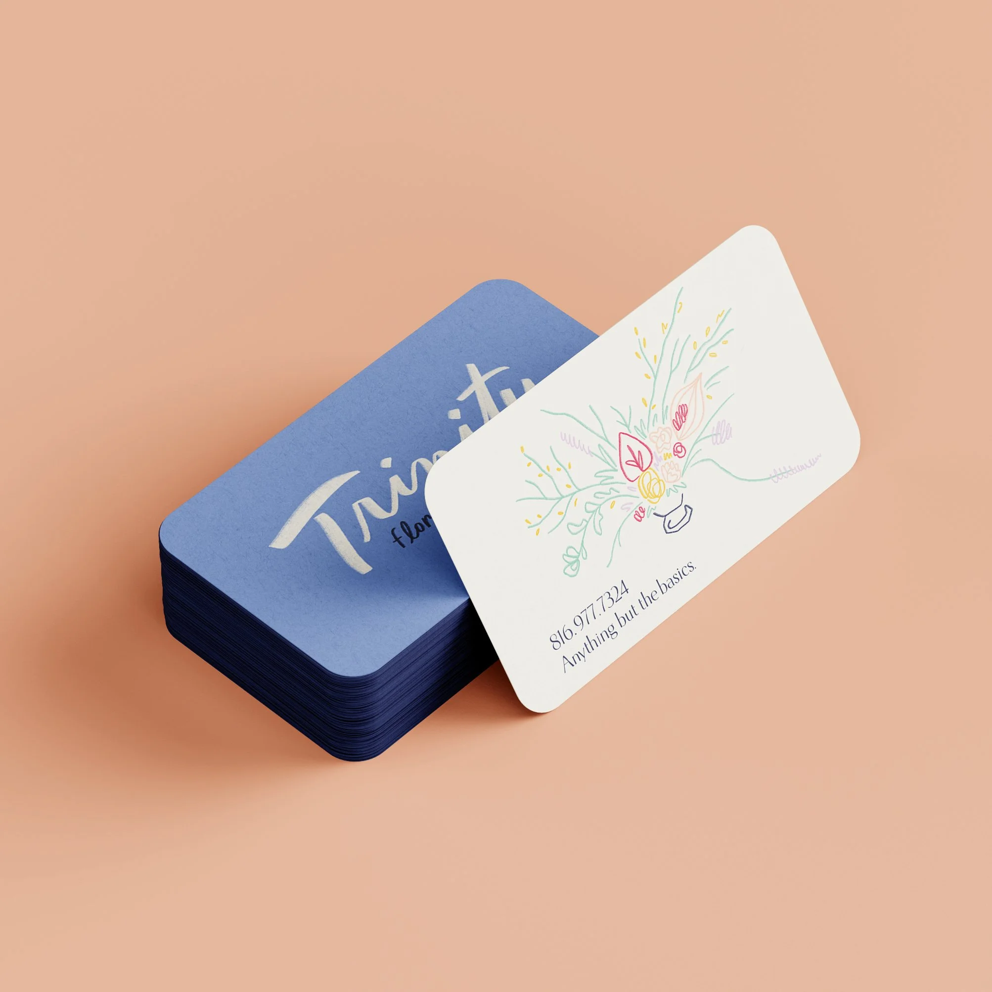
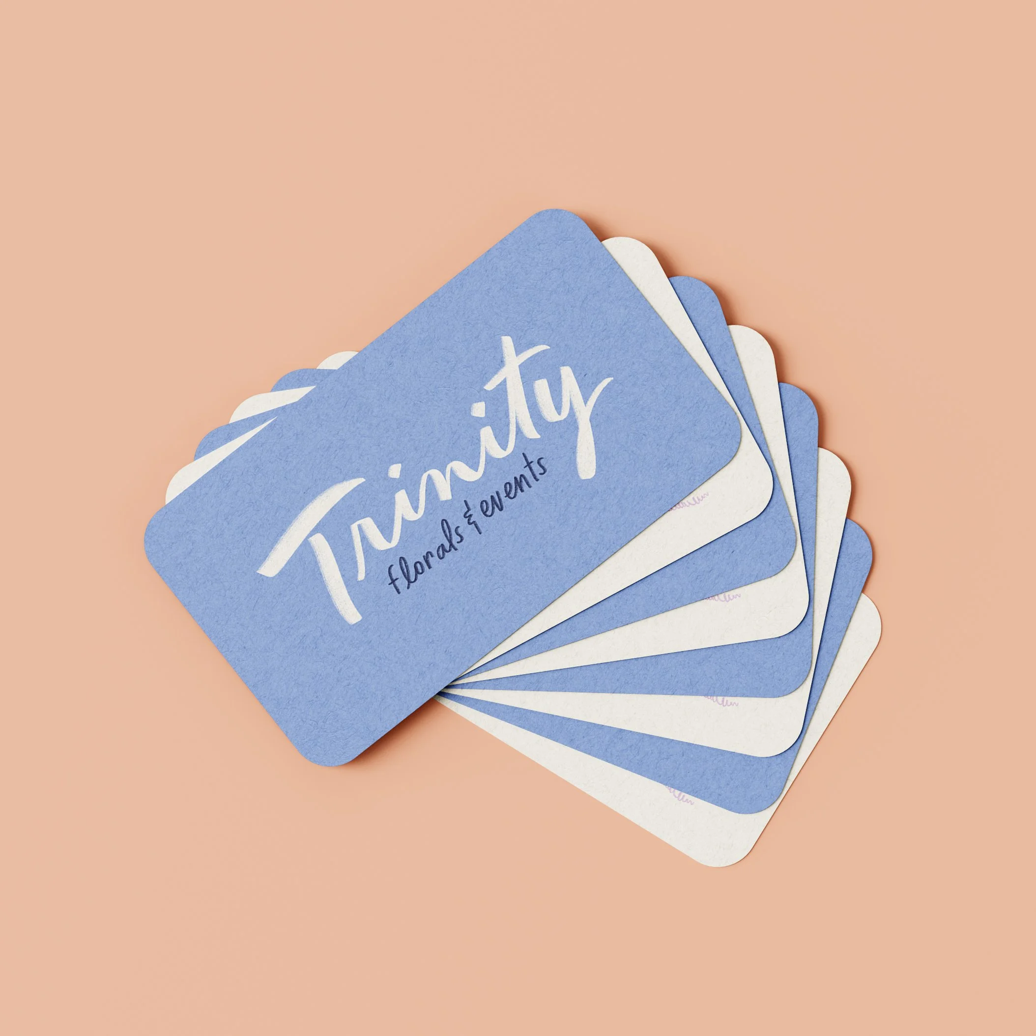
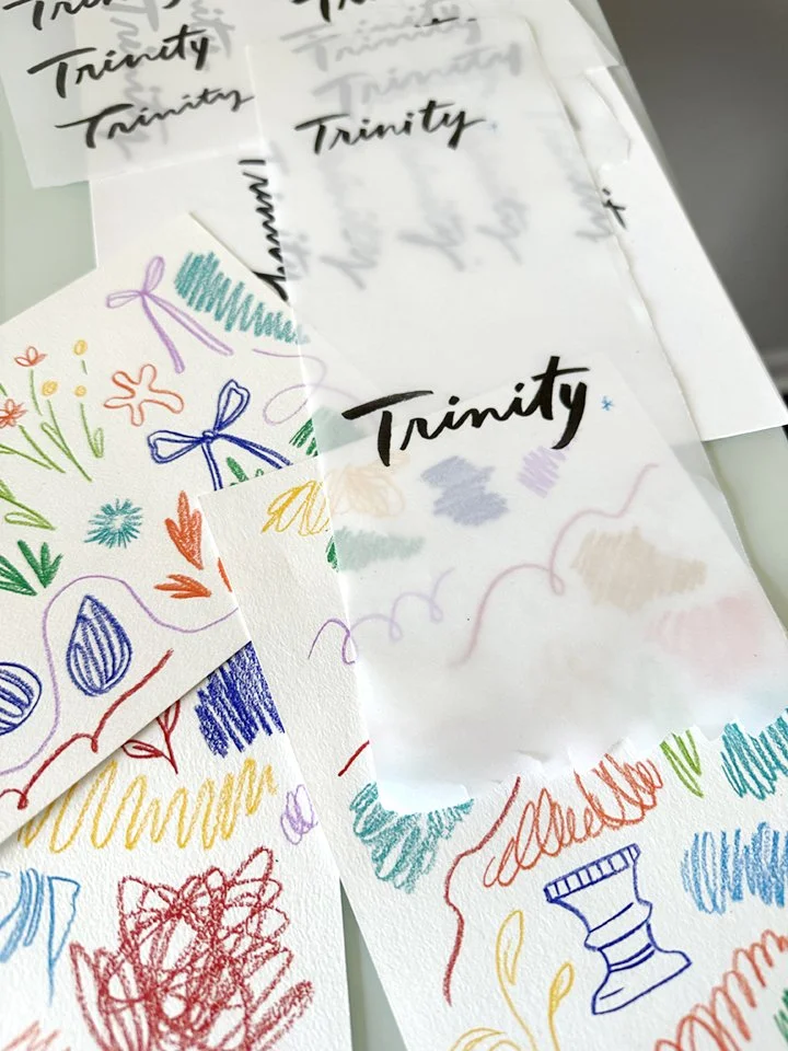
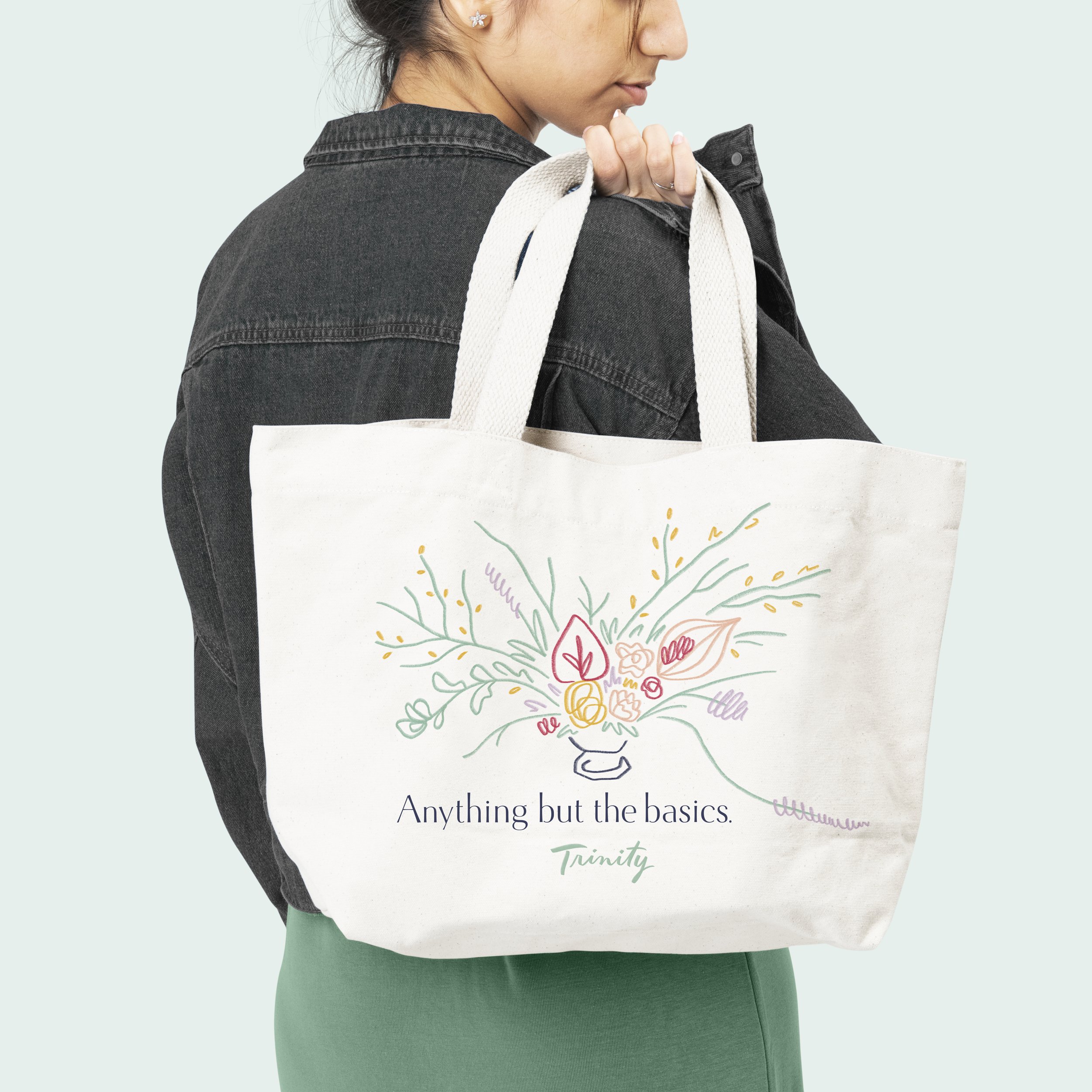
I worked closely with Trinity to understand her aesthetic, vibe, and inspiration. I listened carefully as she described her vision for her brand, and I used textured tools like colored pencils and brushes to give her branding that hand-of-the-artist feel. We collaborated on every aspect of her brand, from the logo to the color palette to the font choices.
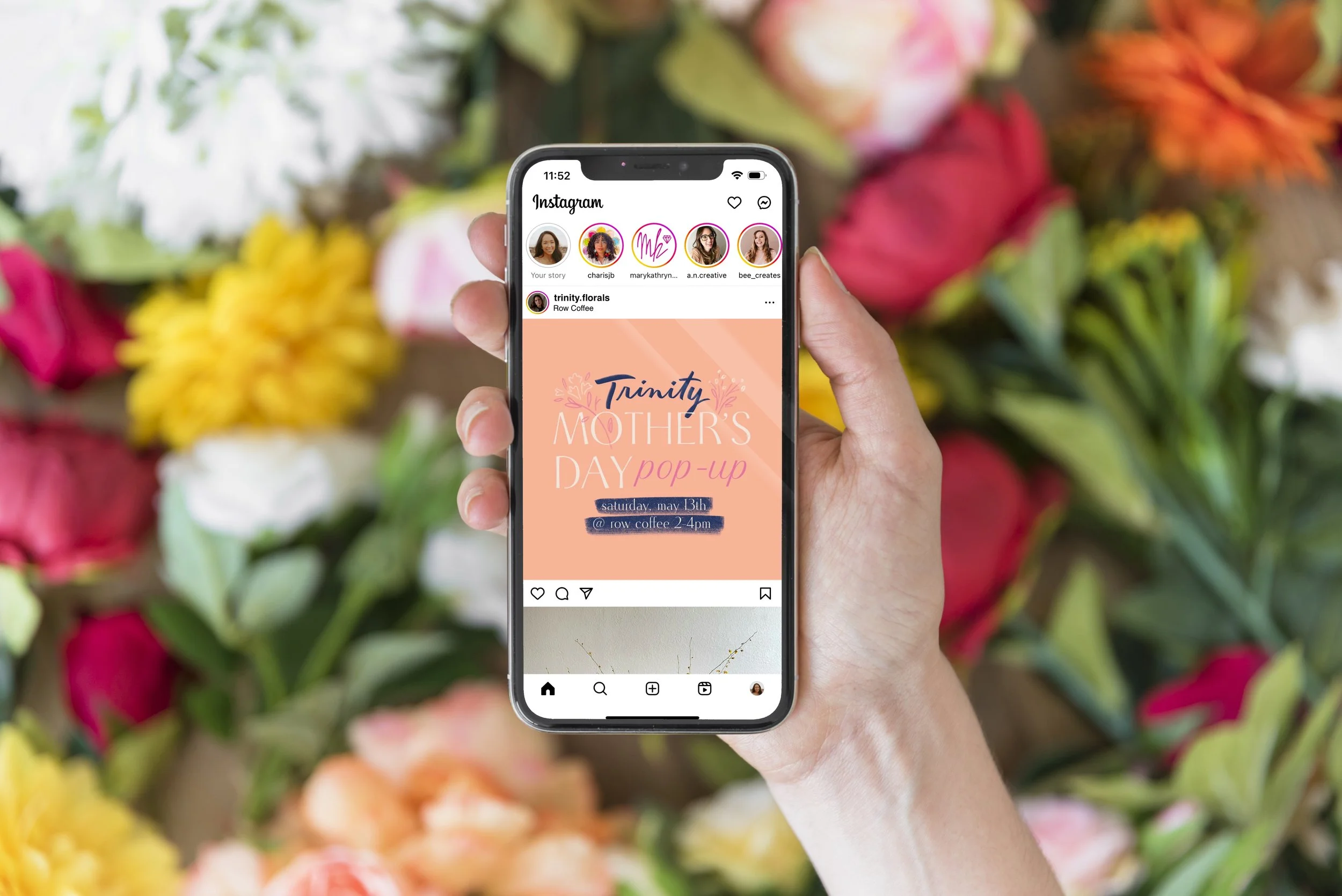
The transformation was amazing. Trinity's new branding perfectly captures her unique style and approach, and it helps her stand out in a crowded market. Her new branding and marketing materials look like works of art themselves, and they perfectly portray Trinity to the world in a more authentic and effective way.
Today, Trinity's business is thriving. She's attracting more clients than ever before who appreciate her unique style and artistic vision. And she knows that she has a partner in me, someone who understands her brand and can help her continue to grow and evolve in the future.